Able tools is a company with a focus on people in
need of rehabilitation and self-help products and
services.
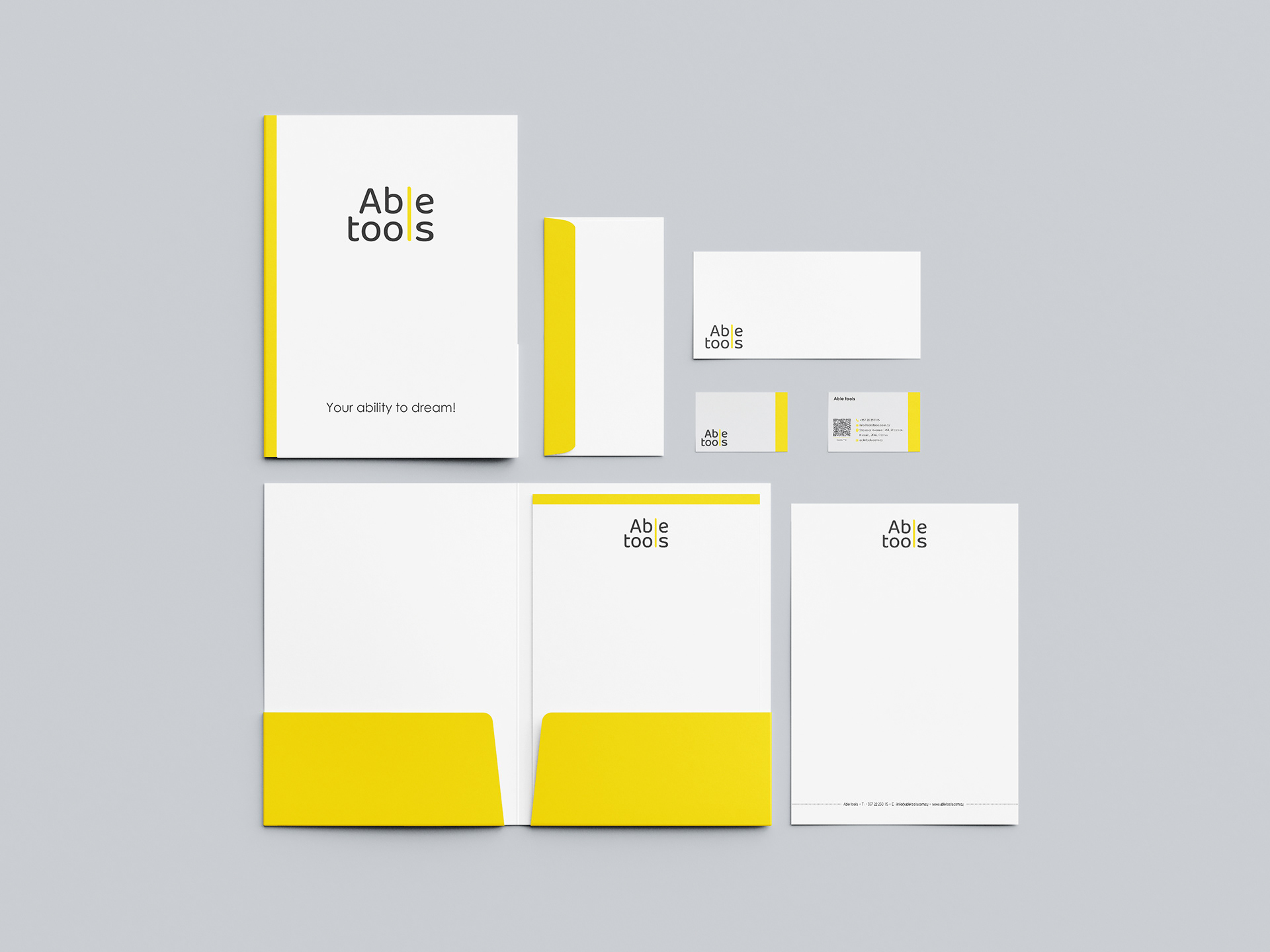
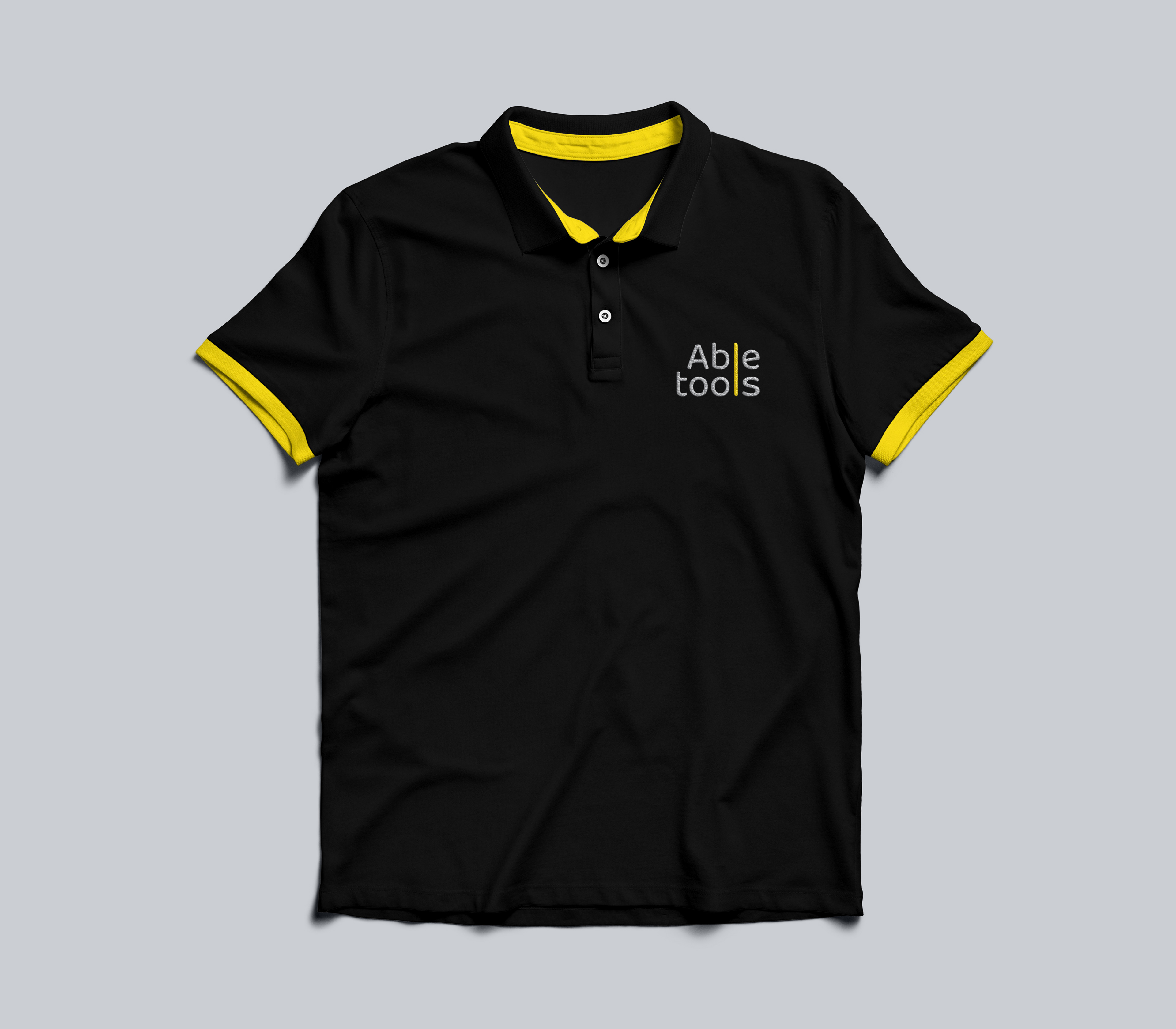
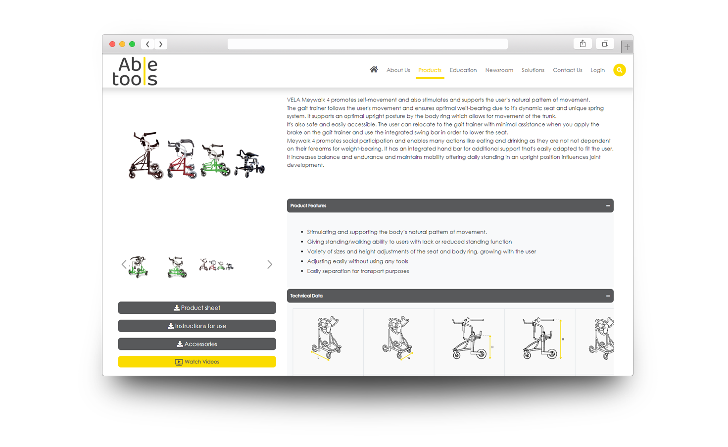
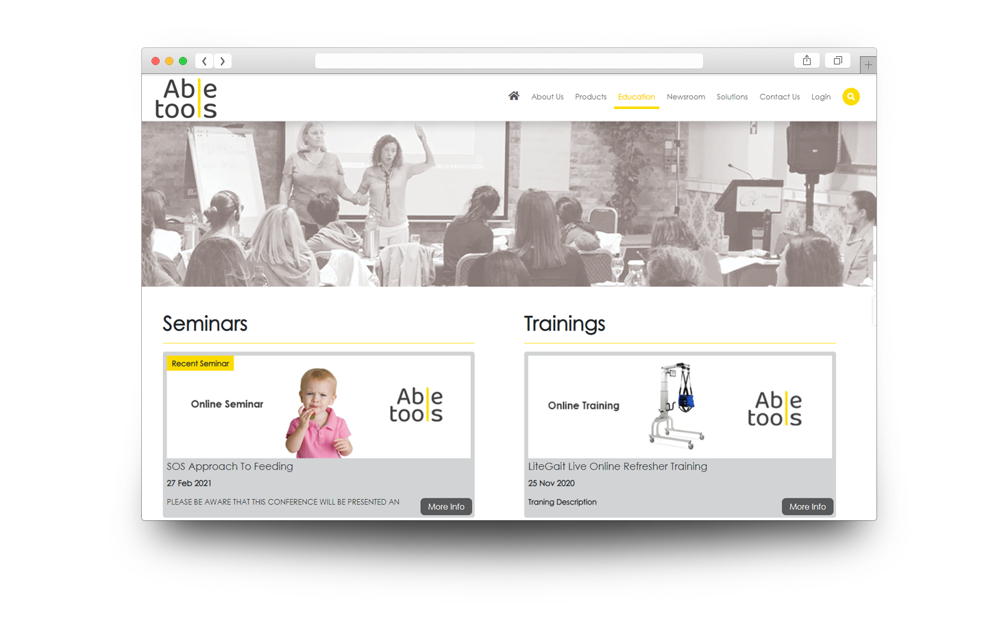
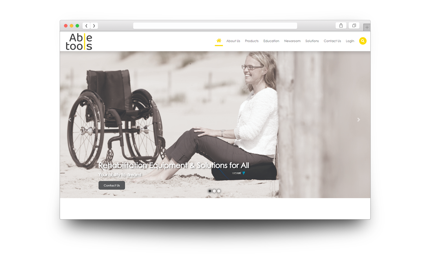
The project is focused on rebranding design, providing
creative services for advertising purposes
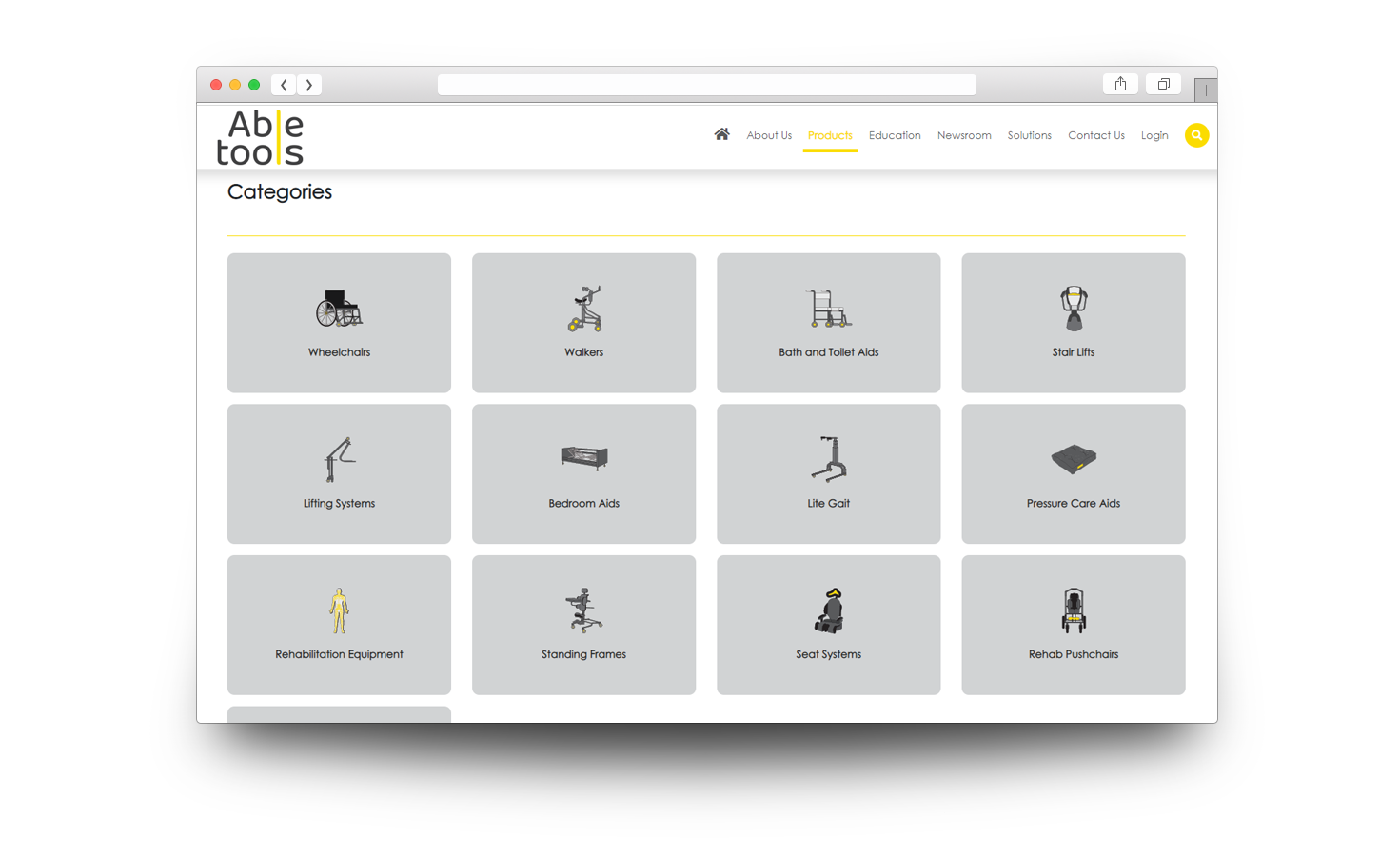
and Social Media management and webpage redesign.
Starting with the logo, the idea was based on the
spine as the main support element of the body
represented by the letter ‘l’ , connecting the
words ‘Able’ and ‘tools’. The chosen colors were
yellow (symbolizing the energy and warmth that
embedded in the service provided to clients) combined
with dark grey (representing neutrality and
balance).
Website design
Branding Material

